All fixed! For posterity’s sake, here’s how it looked before:
Details
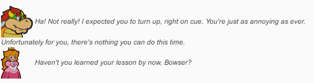
@LaminatedMoth was basically on point about the images in the post requiring a change to their vertical alignment. As it was, images in posts had vertical-align: middle, which produced the behaviour shown in the image above, and it does look rather janky.
The fix was to create a new rule like this:
.topic-body .contents img {
    vertical-align: baseline;
}
By bringing the alignment back to the text baseline, dialogue with character portraits should look a lot better. It does add a little extra space between the bottom of the image, but I’ve not yet seen anything else out of the ordinary. Do let me know though if there is!