Ha! Not really! I expected you to turn up, right on cue. You’re just as annoying as ever. Unfortunately for you, there’s nothing you can do this time. Haven’t you learned your lesson by now, Bowser?
In SA, the text would instead go to the bottom of the line, which makes it flow better with line breaks. Here’s how it looks there.
Kind of a minor nitpick, but I think at least the option to have the text on the bottom would be great, since at least for me it looks much better that way.
I can’t think of a situation on an LP forum where you wouldn’t want images in posts with vertical-align: text-bottom. Needs fixed in the .css.
I think @Law handles that stuff?
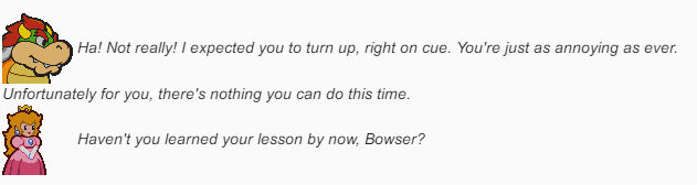
@LaminatedMoth was basically on point about the images in the post requiring a change to their vertical alignment. As it was, images in posts had vertical-align: middle, which produced the behaviour shown in the image above, and it does look rather janky.
By bringing the alignment back to the text baseline, dialogue with character portraits should look a lot better. It does add a little extra space between the bottom of the image, but I’ve not yet seen anything else out of the ordinary. Do let me know though if there is!
 Ha! Not really! I expected you to turn up, right on cue. You’re just as annoying as ever. Unfortunately for you, there’s nothing you can do this time.
 Haven’t you learned your lesson by now, Bowser?