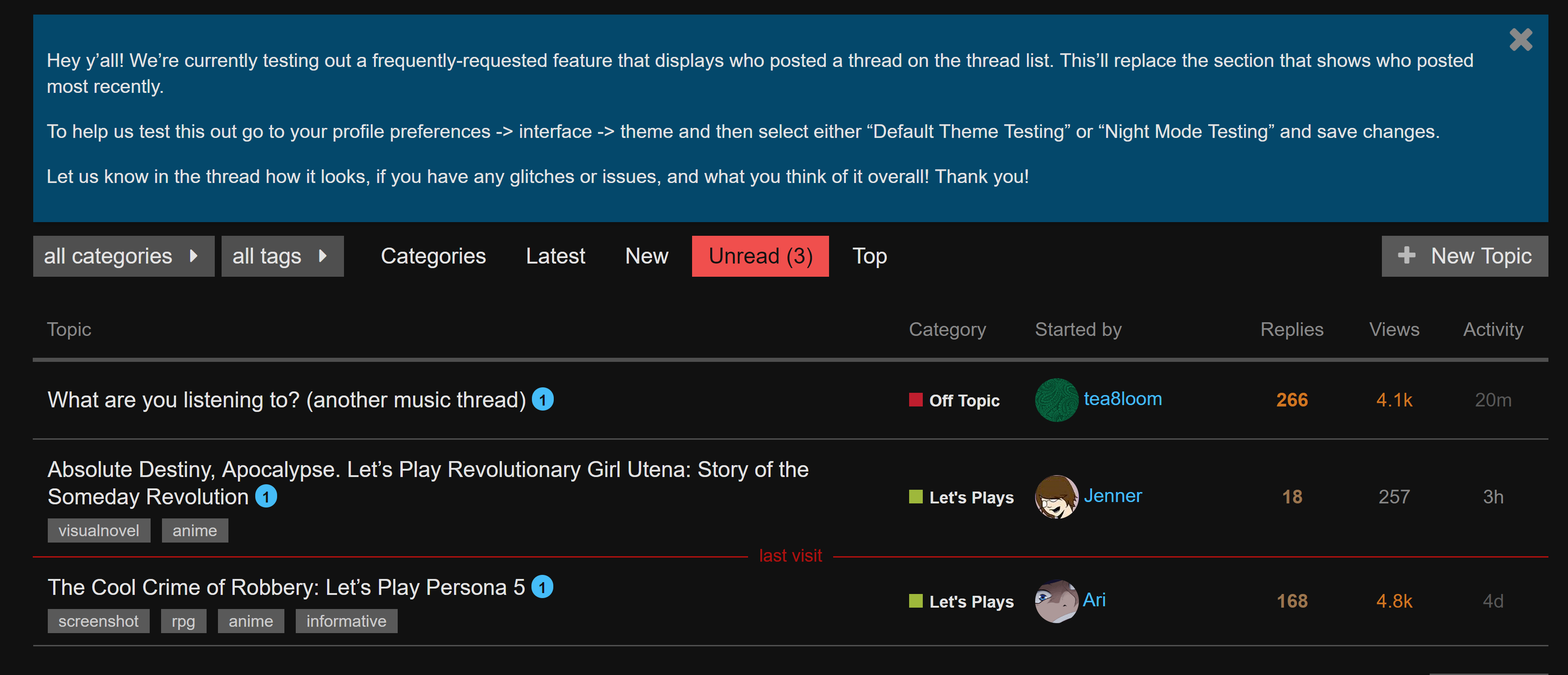
Hey y’all! We’re currently testing out a frequently-requested feature that displays who posted a thread on the thread list. This’ll replace the section that shows who posted most recently.
To help us test this out go to your profile preferences → interface → theme and then select either “Default Theme Testing” or “Night Mode Testing” and save changes.
Let us know in the thread how it looks, if you have any glitches or issues, and what you think of it overall! Thank you!
I’m using the Night Mode Test style on a PC running Opera and it looks fine for me once I reloaded the page! Will continue to read/post and see if things change at any point.
I like it being more clear who started the thread, though I’d also appreciate being able to see the latest poster.
Other thoughts:
The alternating post backgrounds is a little extreme to me, possibly due to the lines between posts emphasising them. Or because they don’t stretch across the entire width of the page.
The larger avatar size is nice, but they feel a little too close to the post text, like it’s all cramped together when it seems like it could be spaced out more. Maybe too large in proportion to the current size of the poster’s name?
Thanks for the feedback! To address some specific points made so far:
The way in which participants were listed in the thread list did show who started the thread, but some users found it less useful than simply displaying a name.
Displaying the aura around OP’s avatar when they’re the most recent poster is possible, but it might get visually busy, since I agree that the list should display the latest poster in the thread, so it might be redundant when putting the OP and Activity column side by side.
The positioning of user avatars might feel cramped as a result of the avatar flair being a little too close to the text. It should be pretty easy to fix that up.
I’ll be making some changes to the testing theme over the next couple of days, and I’ll update this post when it’s done!
Edit: The thread list now shows the original and most recent posters side by side. Whitespace has been increased on the side facing the avatar so they’re not so tightly bunched together.