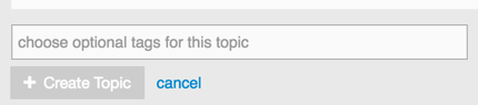
It seems like buttons to confirm dialogs have this style of light grey + white text. This makes it seem like the button is disabled for some reason, waiting for me to do things in the dialog box until the state is valid.
Example:
I understand that hovering make it obvious that it isn’t disabled, and I know this is a nitpick. I just wanted to post on your forum and try to be helpful at the same time. I don’t really have a suggestion for fixing it, except maybe making it consistent with other buttons that don’t seem to have this problem. I’m looking at the New Topic button, which is the same grey with black text.
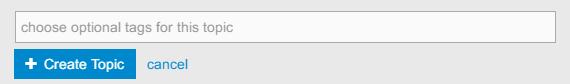
I didn’t notice that earlier when the CSS was added since I just assumed it would work, but clearly it’s causing a bit of confusion! I’m testing a fix for it right now, and it’ll add at least 5% more blue to the site!
The technical stuff
The selector .btn that I overrode in the theme (to improve the contrast) also overrides the built in rules set out by .btn-primary, setting it a background of #ccc (grey), instead of #08c (blue).
The fix for this is to target .btn.btn-primary, which essentially means to target buttons with both those classes. If nothing goes wrong, I’ll update the styling for the site and it should be good!