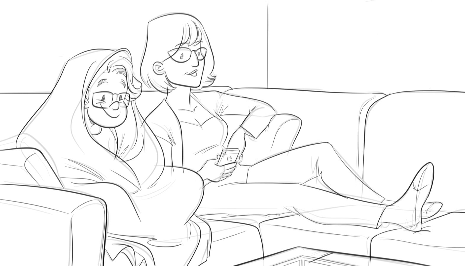
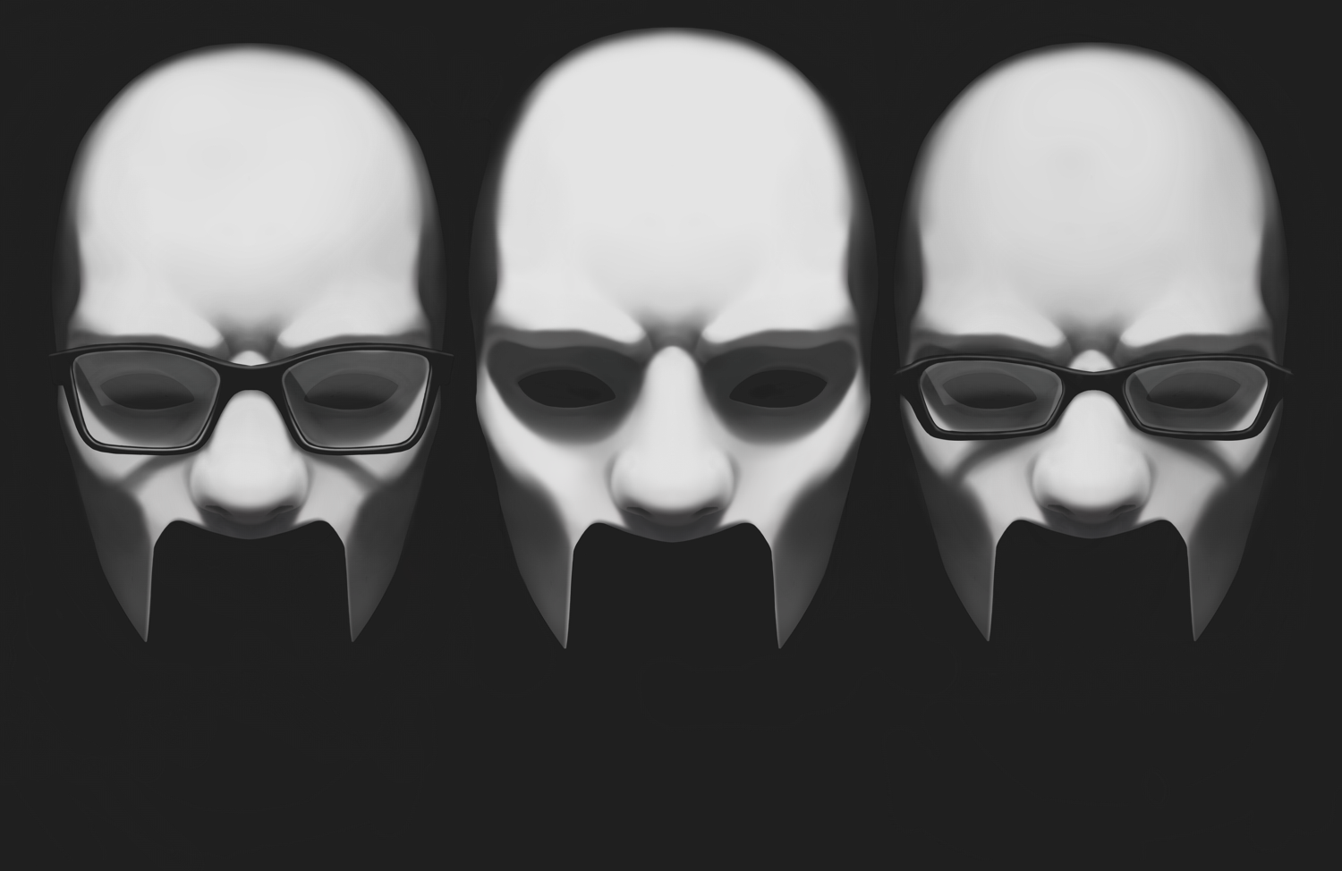
Hey everyone, my LP partner GenghisKait and I have been doing LP’s on Youtube for a few years now, which means we’ve got quite a few titlecards under our belts! I felt it was high time that we assemble all the titlecards in one spot in case anyone wants to take a look at them in higher detail.
All the titlecards have had their text removed, so what you’re seeing here is the bare art. Empty spots are likely intentional as that’s where the game logo would go!
All of the titlecards done by me were made using a combination of Sketchup, Sketchbook Pro, and MangaStudio (Which I believe is now called ClipStudio). Titlecard done by GenghisKait are done with Photoshop.
And if anyone’s interesting in checking out our LPs after perusing our titlecard gallery, you can find them by checking out Genghis’ Youtube Channel.
Clocktower (SNES)
Baby’s first Let’s Play, also one of baby’s early attempts at digital painting. My inability to blend gave this one a unique texture, it kinda reminds me of fingerprints in clay. This titlecard ended up starting the reoccuring theme of Genghis and I always appearing in the titlecard for each game. I remember struggling for quite a bit on the wrinkles in the blanket, I ended up posing a towel to try and give me an idea of how the fabric should wrinkle. For the final titlecard we applied a Photoshop effect to it to try and make it look a bit more like the pixel art used in the game.
Clocktower (PS1)
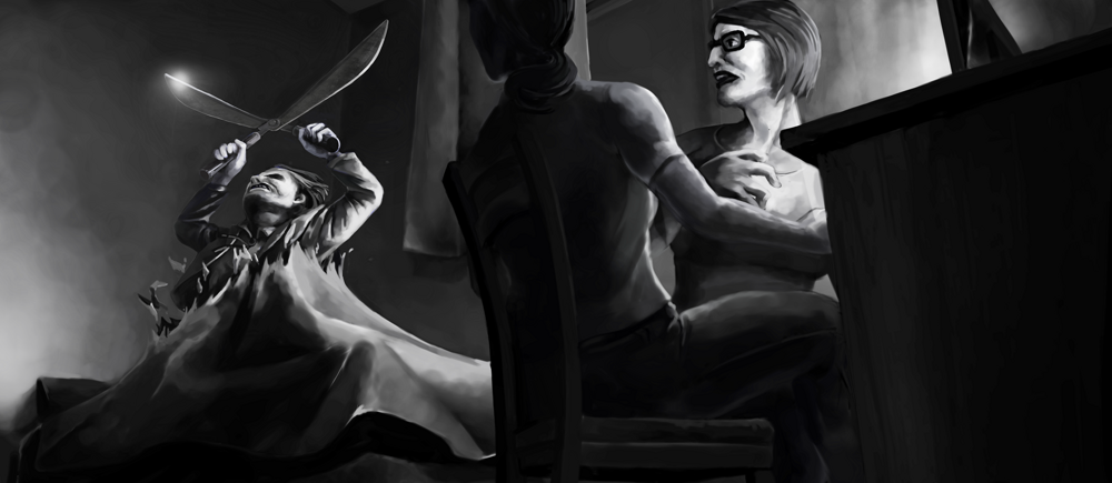
Photo reference is a great help, don’t ever let anyone tell you that you shouldn’t/can’t use it. Did you catch my subtle hint that I used photo reference for this one? Because I used a lot of photo reference. I also used Sketchup to model the room environment so I could try out a few different angles before settling on this one. That Sketchup model ended up being pretty handy as I got to reuse it for a few later titlecards as well. I also started using MangaStudio’s 3D model tool to pose 3D figures to help me figure out how the characters could sit in the scene. My blending is way better in this titlecard, I must’ve discovered the airbrush tool in Sketchbook Pro.
I ended up referencing Lon Chaney’s Phantom of the Opera for Scissorman here. I can’t find info about it, but I wouldn’t be surprised if the game devs used Lon Chaney as a reference for Scissorman in the game as well. As you can see this is where my user icon comes from!
Clocktower: Struggle Within
Photo reference, photo reference, photo reference! As you can tell the quality of this one sky rockets because instead of guessing how human figures would look in this scene, I was able to reference real humans.
I’m harping on this photo reference thing mostly because I find a lot of maturing artists have a weird attitude and/or phobia about using photo references. In University I once had a guy get angry at me when I told him he should just google how to draw a braid.. Don’t feel bad if you have to google something or set up a diorama to figure out how it’ll look in a scene! One of my favourite documentary’s, Tim’s Vermeer, deals with the discussion of artists and the tools they use to make art.
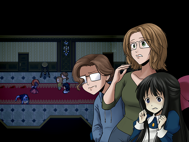
The Colonel’s Bequest: A Laura Bow Mystery
This is the first titlecard done by GenghisKait! The rule of thumb is any pixel art is done by her, any digital painting or traditional drawing is done by me. We usually try and match up the titlecard to the game, so any game heavily featuring pixels will likely have the titlecard done by Genghis. I did help by providing Genghis a 3D mock up of the room and figures though (I provided moral support too).
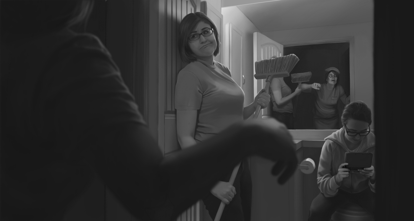
Clocktower 3
So in addition to the “pixel art equals pixel titlecard” thing, we also try and make the titlecard match thematically with the game. If it’s a serious game, serious title card. If it’s a goofy ass game like Clocktower 3, it gets a goofy ass titlecard. This one could’ve turned out better. There was intended to be a tiny hint of colour in this one. I hadn’t yet figured out how to apply colour to my greyscale under-painting and I wanted to add some colour, but it just wasn’t working out so it was removed. As a result I feel it’s very hard to tell what’s going on in this titlecard, which is that the doofy side character Dennis is menacing us, in lieu of any of the real villains of the game. I think if I was able to put a bit more colour into this one Dennis would’ve been a bit more recognizable, but I’ll also cop to the fact that this layout isn’t really the best way to stage the scene. I like the idea of this titlecard, but I don’t like the execution.
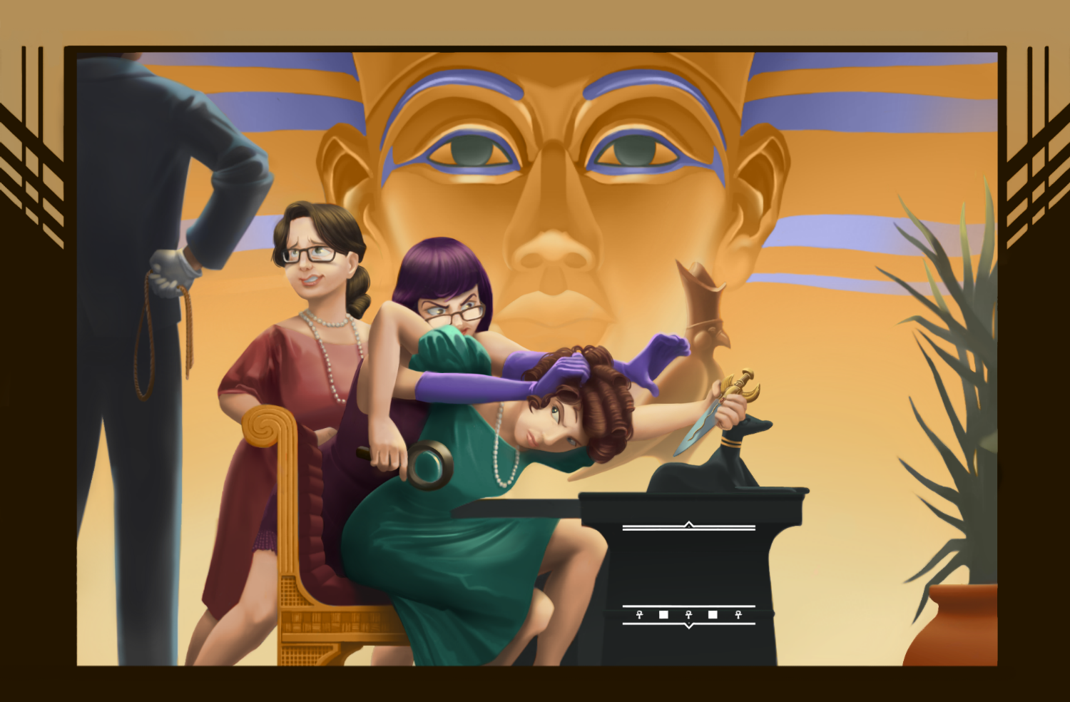
Dagger of Amon Ra
Now this is a titlecard where I loved the execution! To this day this is probably my favourite titlecard. As you can see, this is the first one I did that was in colour! I’m still figuring out best practices with my titlecards, but isn’t this one a huge improvement? The final titlecard has some effects applied to it to make it look even more like the original box art, which this scene is based off of. Fun fact, but the reason why this titlecard is based off the box art? I didn’t want to spoil myself to anything in the game, so I looked up the box art and thought it was a good enough visual to insert myself and Genghis into.
Fun fact number two, but this titlecard partially saved this LP. Genghis and I recorded the first three episodes and we basically debated if the game was interesting enough to LP. We debated dropping it then and there, but I had actually finished the titlecard before we started recording and because I really liked how it turned out I didn’t want to let it go unused. So we decided to go forward with the LP and it turned out to be one of our favourite LPs thanks to how crazy the rest of the game gets! To this day I am hoping for a new Laura Bow game.
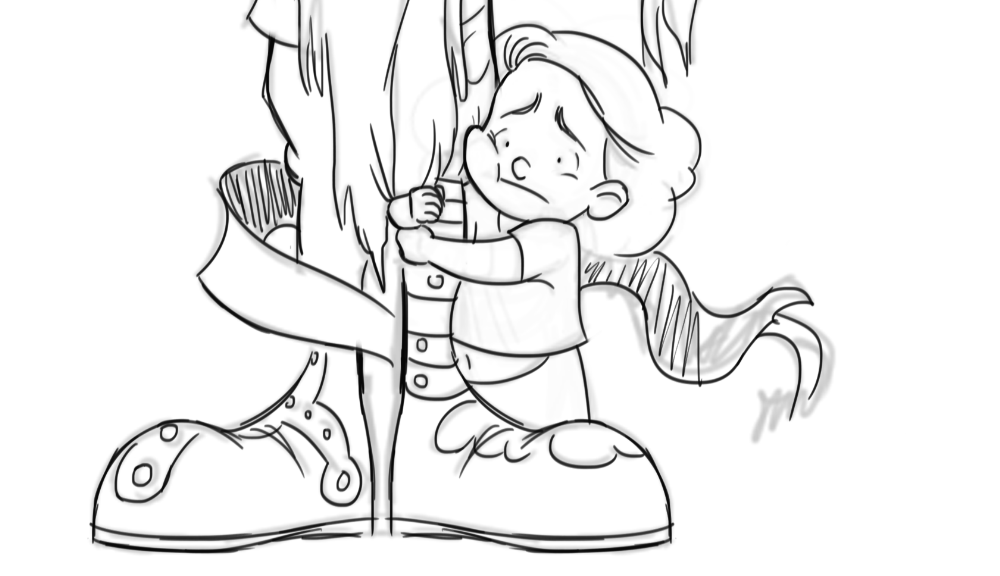
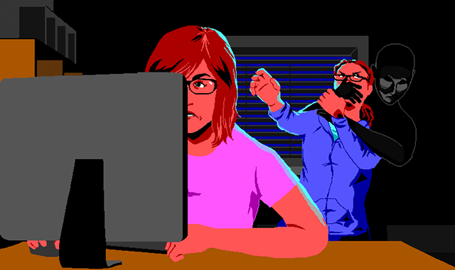
Return of the Phantom
Baby Shaw’s first LP! Genghis is usually the one in the driver’s seat for our LPs, so this was my first time doing the playing/recording/editing. I totally cried out of stress like, four times while recording the LP (Which uh, is basically why I am usually the one not recording, I get stressed if shit doesn’t go perfect). I’m a big Phantom of the Opera fan, I ended up making a huge amount of notes for this LP based off how it differs from the original book. If you like hearing someone complain about how “it’s not the same” then this LP is for you!
We went with another “Titlecard based off the box art” for this one primarily because we had a short amount of time to get the LP started. Had we had more time I would’ve gotten Genghis to do some nice pixel art for this one. It’s funny looking at this one now because Genghis and I have both changed glasses since recording this LP, so I honestly can’t remember which mask is which. I think I’m likely the one on the right.
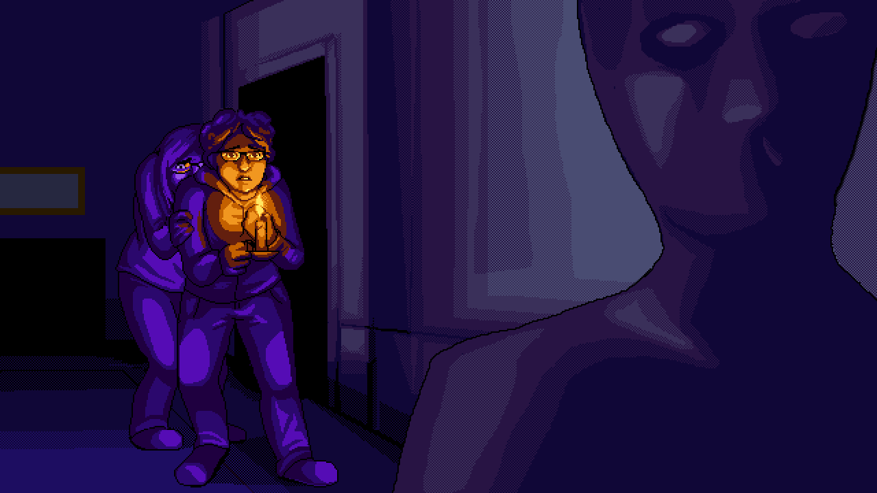
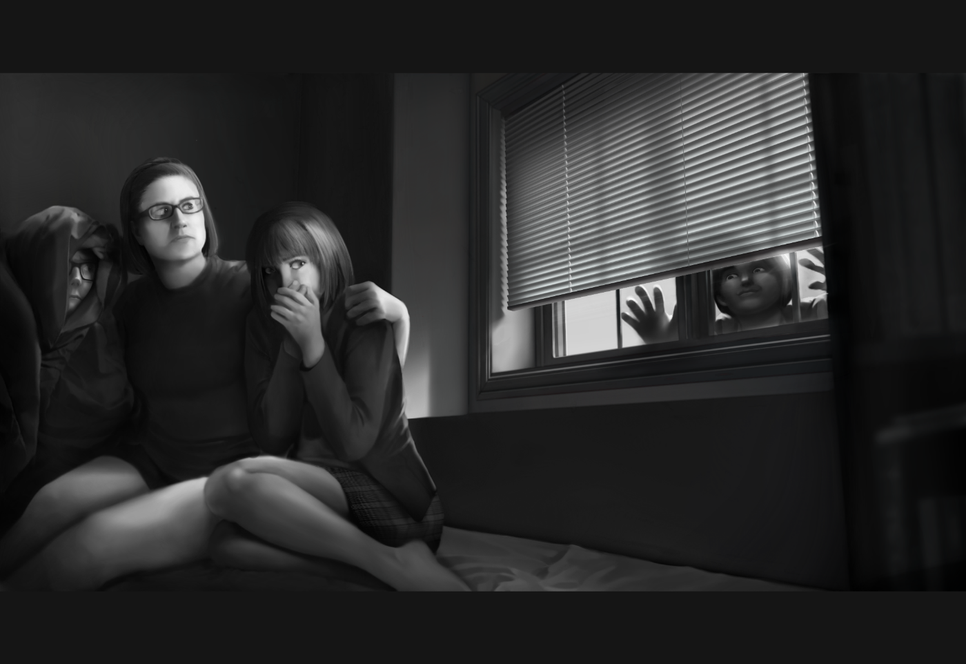
Missing
Genghis really gets to show off her pixel art chops here, as a result this is one of my favourite titlecards. I do have to deduct points for the unrealistic content though, for I am a small flabby woman-child and there’s no way that I would be the one taking the lead following a spooky silhouette in a darkened hallway.
Fun fact but I also did some pixel art back in my day, but it was mostly limited to trying to make anime sprites in MS Paint to sell on GaiaOnline.
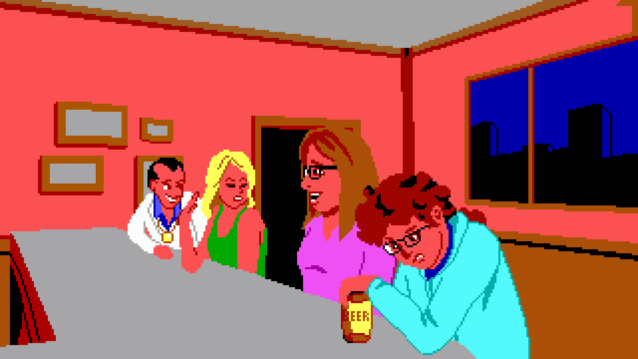
Leisure Suit Larry
My second LP! (I cried at some point while recording this one too). Genghis provided the titlecard for this one (and I again provided a 3D mock up for her to use as reference). At this point you should be realizing that I rarely wear anything aside from a hoodie/ponytail combo. Me holding a beer is a nod to the fact that I don’t drink alcohol, something that absolutely no one will get unless you know me in real life. I’m supposed to be sneering at the beer, but you can probably also read that expression as me being a surly drunk.
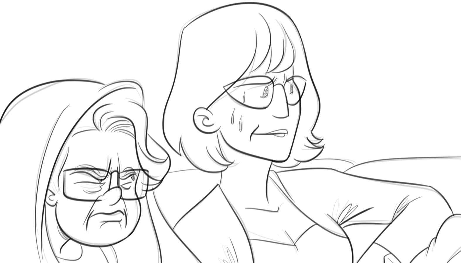
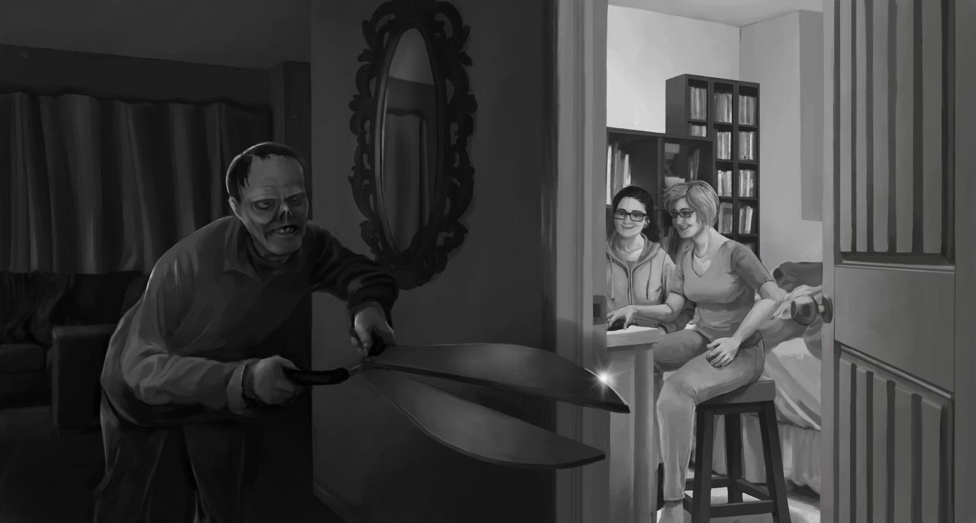
The Orion Conspiracy.
Ohhh lord the Orion Conspiracy. So you know how I said we try and match the titlecard to the game? Silly game gets a silly title card? Well we read reviews for the Orion Conspiracy and it sounded like a cool space drama, something more mature in tone, so it got a mature titlecard. Turns out the game goes a bit koo-koo bananas, if only we knew! Don’t zoom in too close on our reflections in the glass… lets just say I didn’t originally plan to post the titlecards anywhere so I never thought I would need to put that much detail into our faces here.
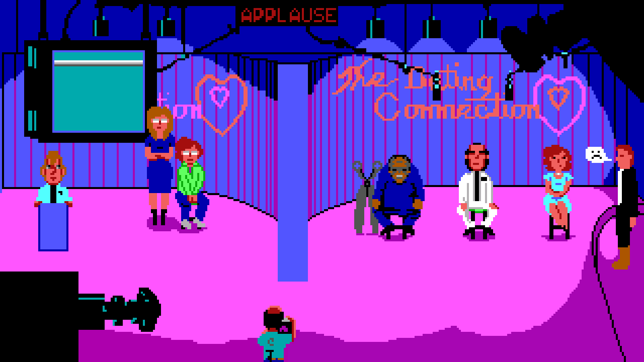
Leisure Suit Larry 2
Another Genghis card here! If you don’t recognize them the dating contestants are Scissorman, Larry Laffer, and Laura Bow (With her love interest Steve Dorian waiting in the wings). I really like how Genghis did Scissorman here, he looks like an adorable potato man.
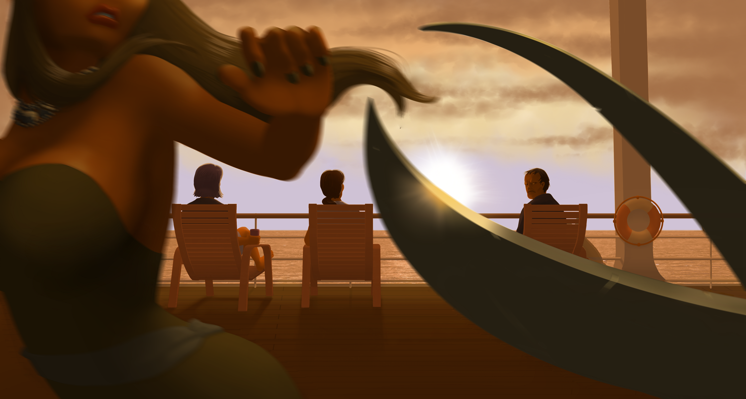
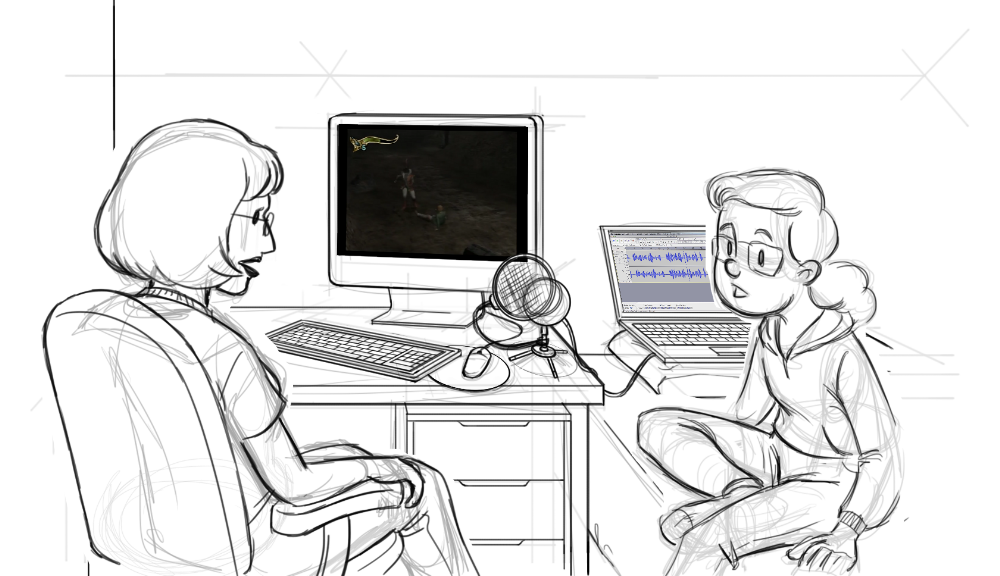
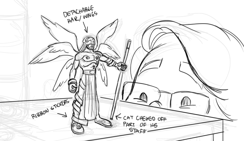
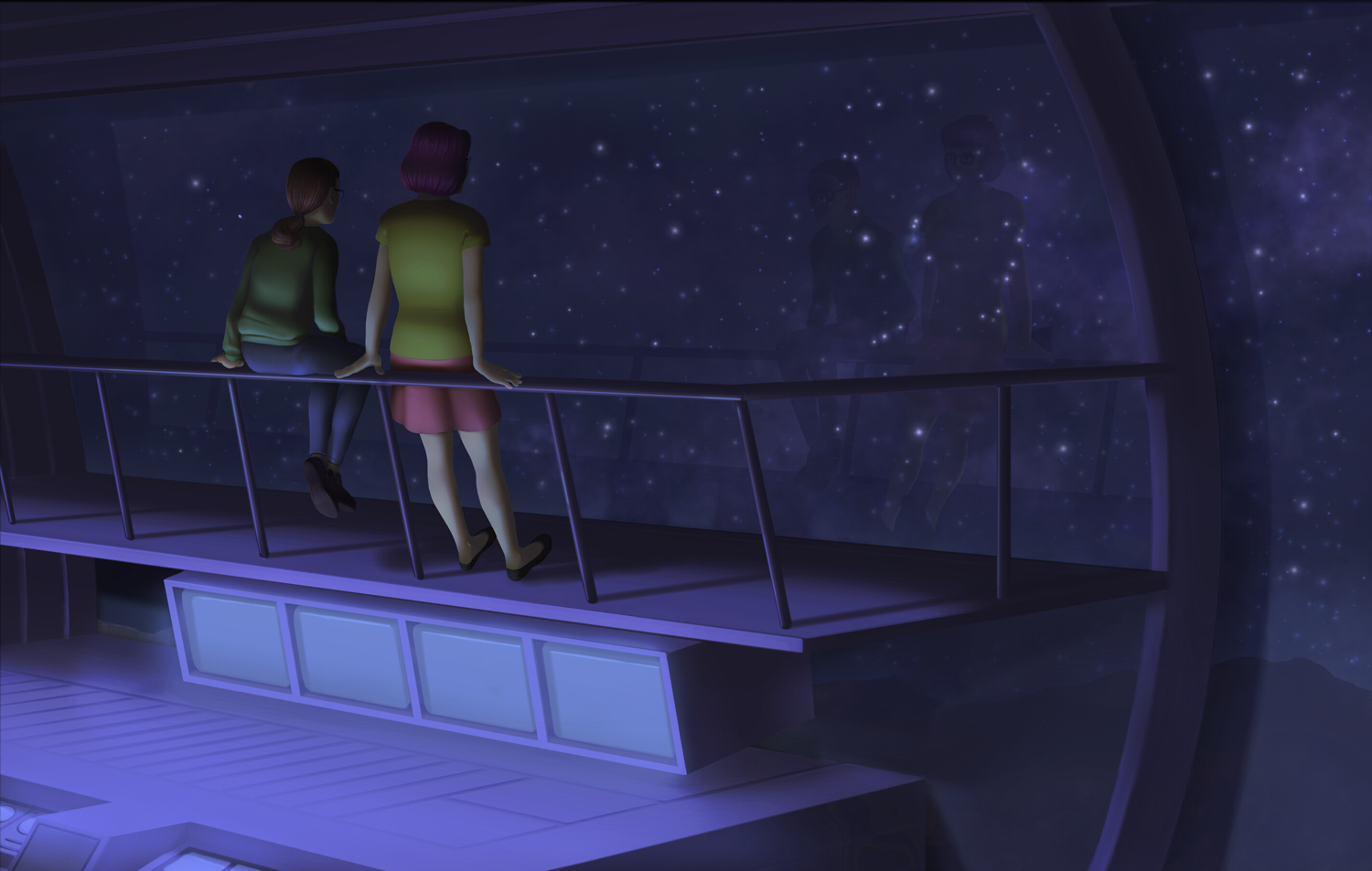
NightCry
This game, oh lord this game. We knew this game would be nutso, but little did we know how nutso it would get! I feel like the titlecard isn’t zany enough for what the game turned out to be. Special cameo by Scissorman on the rightmost deck chair there. GenghisKait gives me crap because she thinks I drew him hunky, I think she’s trying to blame some weird attraction she has to Scissorman on me.
As with all my titlecards, the environment was modelled in Sketchup to help me figure out the perspective. The water texture was taken from a free image stock website, I haven’t quite figured out how to do water effects yet (Or clouds for that matter…)
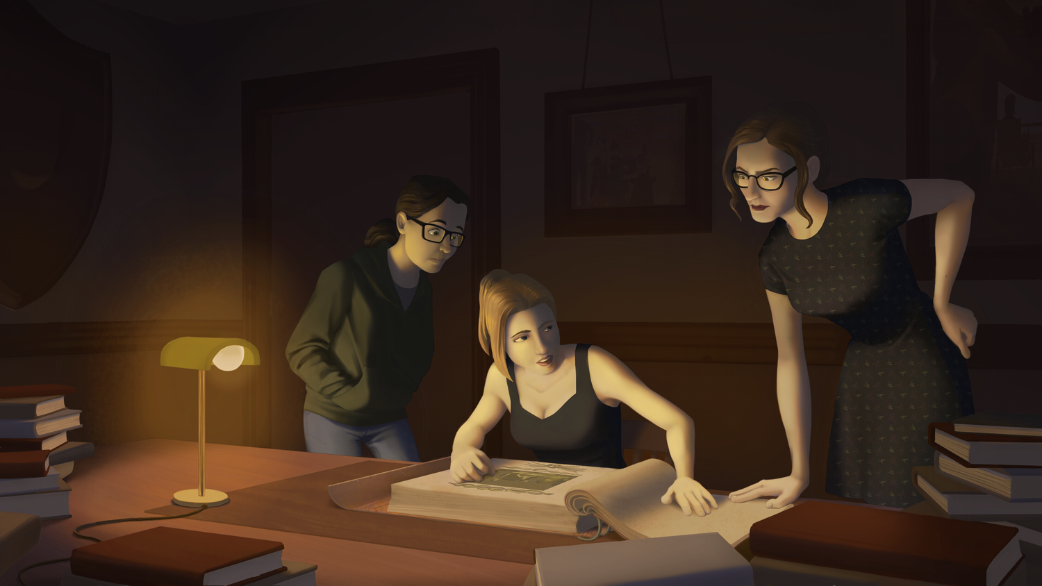
Eternal Darkness
This one was a bit tough to put together, I’m still not 100% happy with it. Something’s just not quite gelling and I’m not sure why (Which is a problem I run into frequently quite frankly). I do like how I turned out, probably because (as you guessed it) I used photo reference for how all the folds in that hoodie. I think I need to work on my textures still, this scene could’ve really benefited by some texture variety on stuff like the desk and the books.
It’s hard to make out but the photos on the wall are the Dagger of Amon Ra and Nightcry titlecard. I kinda wish I blended them into the scene more, but it was one of those things where I had to make the choice to either spend no time or a huge amount of time making it look better, and I had to go with no time.
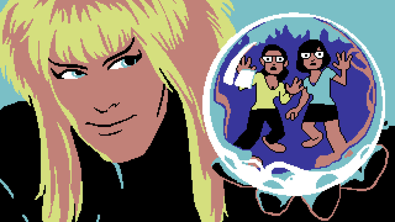
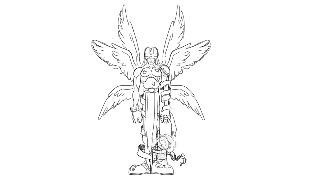
Labyrinth
Genghis Kait did the final titlecard for this one, but I ended up designing and drawing a not-pixel version of this titlecard for her to tweak. If you’ve seen the LP you know that I’m a huge Labyrinth fan, so I couldn’t resist the urge to be the one to draw up how the titlecard was going to look. The look of the characters is based off how they appear in the game, but the overall theme of the card (Characters appearing in the crystal Jareth holds in his hands) is based off one of the movie posters for the film.
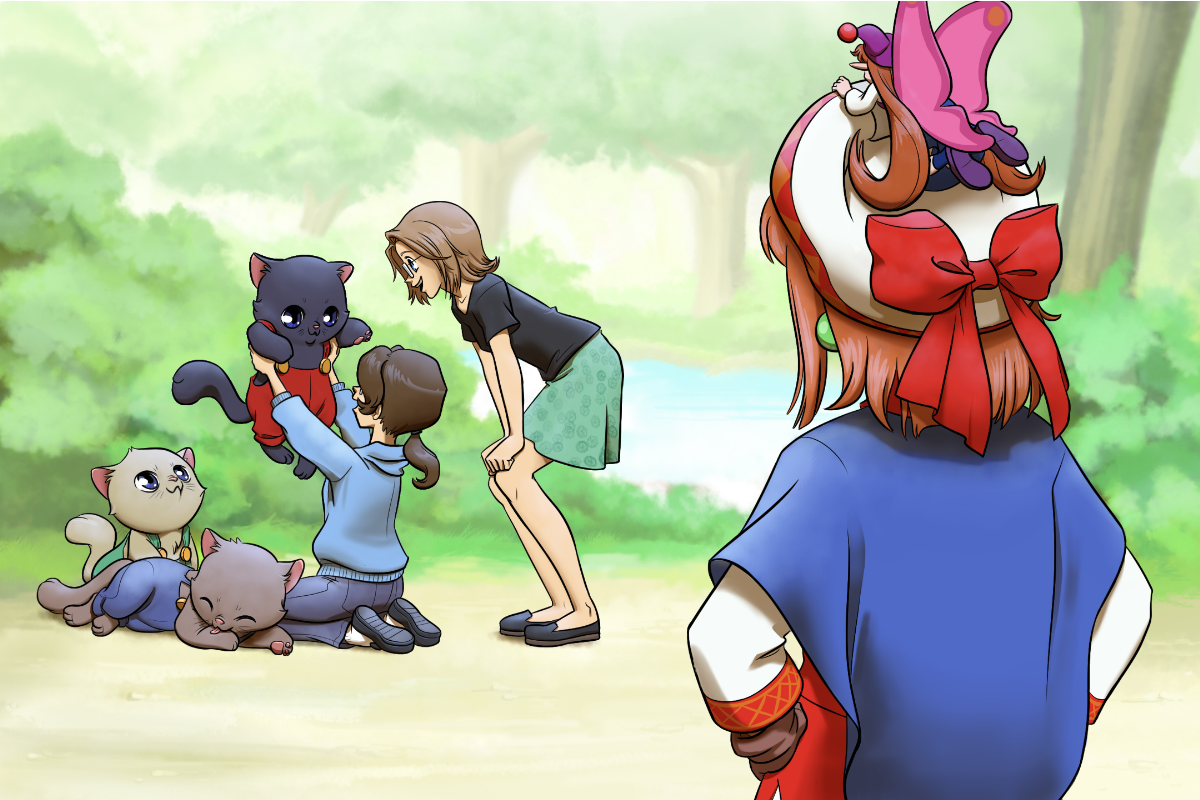
Mad Father
As someone who spent majority of their time from Age 8 to Age 18 drawing anime, this was a surprisingly fun one to do. Nothing takes me back to those halcyon days like drawing some big ol’ anime eyes. It’s also nice to get back to my strength, which is drawing. I’ve only be doing digital painting since about 2014 or so? But I’ve been drawing since kindergarten.
I redrew Aya based off character art from the game, and tried my best to make Genghis and I match her style-wise. Genghis provided the pixel versions of us in the background.
Rhapsody: A Musical Adventure
Man, we had a tough time coming up with an idea for this one! It’s sometimes very hard to come up with a still image that represents the entire game, especially when you’re like me and you’ve never heard of this game before and you are trying to avoid spoilers! Genghis and I went back and forth on it quite a bit, we even debated if Genghis should handle this one and make it a sprite-focused title card, but we both figured something more illustrative would represent the look and feel of the game a bit better.
Fun fact but I had Genghis sent me examples of art from Rhapsody to help me come up with this title card. It’s only looking back at the LP videos do I realize that Cornet and Kururu’s outfits are pretty different in the art than in the game! We haven’t finished the LP yet, so I’m hoping that there’s a costume change at some point, otherwise this titlecard might be a wee bit inaccurate!
Also I want everyone to appreciate that dirt, because that’s the best painterly dirt that I’ve ever done and ya’ll need to know about it.
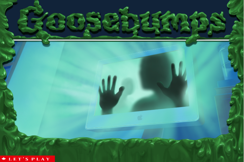
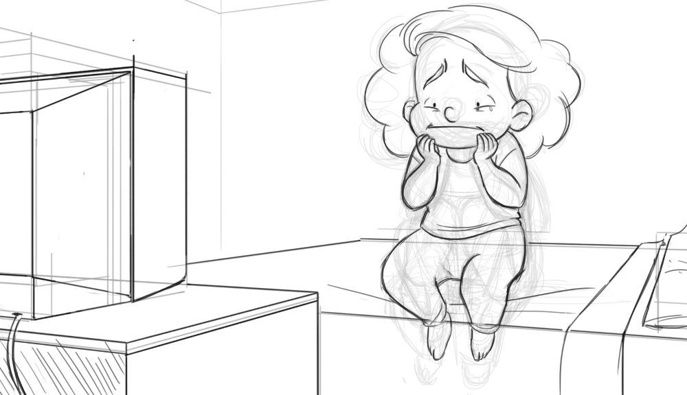
Goosebumps: Escape from Horrorland
The influence for this one should (hopefully) be pretty obvious, I was trying to crib off the covers for the original Goosebumps books. Originally I was going to have the computer oozing green slime, but I kinda felt like that wasn’t enough to make it feel like a real Goosebumps cover. The alternate idea I had was to have the screen be broken and a hand coming out of the screen as a reference to the “Don’t go into the Basement” book cover, but I found that the bright light/silhouette idea seemed more eerie and mysterious.
That said, this title card should probably be more silly than eerie to fit with our rule of “The tone of the titlecard should match the tone of the game”, but it was hard to pass up trying to make my own spooky fake Goosebumps cover.
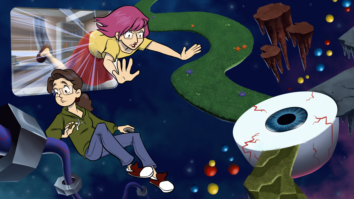
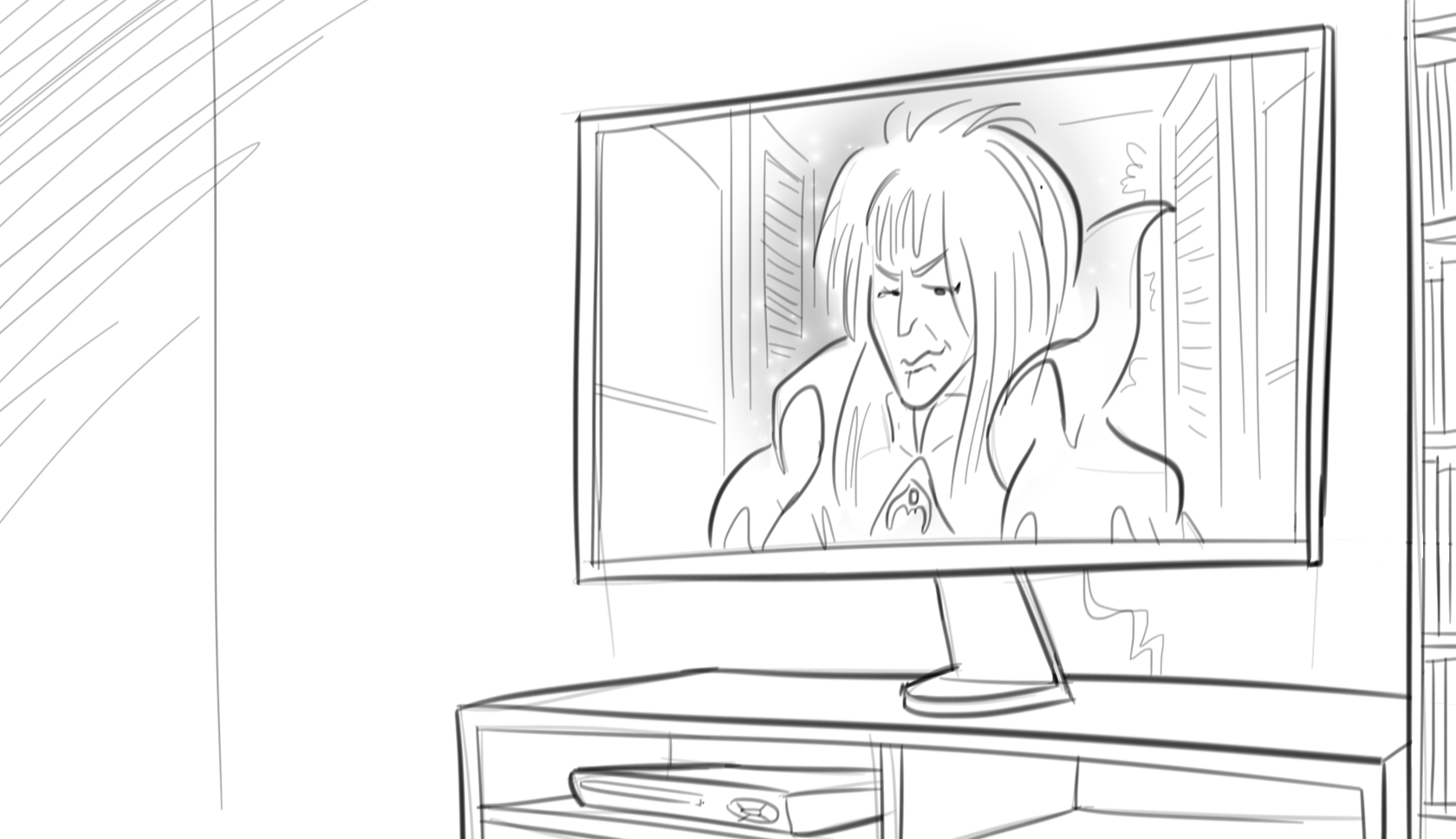
Toonstruck
Another drawing heavy titlecard! The drawing ones are a lot of fun to do, as I mentioned previously I don’t have a ton of experience doing digital painting, so it’s always fun to play to my strengths. That said, I do really like how the painted elements of this titlecard turned out (I think it helps that everything is a bit more stylized/I was able to reference the game for how to paint this scene). I kinda like how if you removed Genghis and I this could pass for a background from the game. Hopefully it’s clear to everyone that we’re being pulled into the toon world through the computer screen! I struggled a bit with trying to figure out how to convey the distortion of the screen as Genghis gets pulled through it.
Speaking of Genghis, I have a pretty established way I doodle myself, but Genghis is always a bit of a wild card. In retrospect I wish I had taken a photo graph of my room instead of painting it, I think it might’ve better contrasted the toon vs real world element of the game. C’est la vie!